I love data. Specifically, I love data visualizations. Infographics, charts, whatever you call it, if it displays data visually, chances are I’ll want to take a look at it. Data graphics tightly integrate the creative and analytical elements that I find so appealing about programming to efficiently communicate information. If a picture is worth a thousand words, an infographic is worth a thousand pictures. Data graphics can take an array of different forms - charts, 3-D graphs, maps, etc., the possibilities are virtually endless. I wanted to explore data visualization tools in Ruby, starting with basic chart functionality.
In learning how to code over the past few weeks, I’ve come to appreciate the flexibility of Ruby and the ability for pretty much anything to be structured as a dataset. Conceptually, I was looking for a tool that could take in a data as an array or hash and convert that data into a table or graph. In perusing Ruby Toolbox, I came across the Googlecharts gem, which is basically a Ruby wrapper for the Google Charts API. In taking a look at the documentation and code base on GitHub, the instructions seemed pretty straight forward, so I figured I’d give it a try.
1) Installing Googlecharts
Getting setup with the Googlecharts gem is pretty straightforward. Like other gems, you can install it straight from the command line by running:
1
| |
Once the installation command runs, you just need to be sure to require the gem at the top of your Ruby file by writing:
1
| |
And that’s it! You’re ready to start using Googlecharts.
2) Let’s Chart Some Data!
The primary class that you interact with when using Googlecharts is the Gchart class. In looking at the source code on GitHub, this class has numerous attributes that can be used to define the data and formatting for bar charts, pie charts, line graphs and scatterplots (the gem also seems to support basic 3-D graphing). When you create a new Gchart, you can pass in a number of attributes as parameters to the new Gchart instance. My first time using this gem, my goal was just to create a simple bar chart with dummy data that would successfully save to my filesystem. So I added an array of a few integers as the data input for the chart:
1 2 3 4 5 6 7 8 9 10 11 12 13 14 | |
Running the above code in my terminal (still with “require ‘gchart’” at the top) produced this:
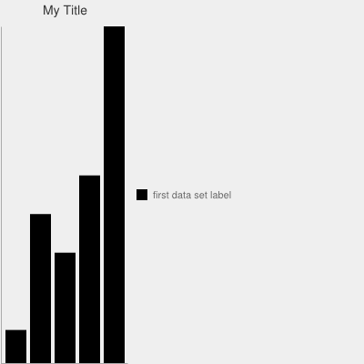
It gets the job done, but its not too exciting for a few reasons. First, there aren’t any y-axis labels; I have no sense of scale or measurement. Second, there are no labels on my data bars. Third, only one set of data is displayed; what if I wanted to compare two related datasets next to each other? In order to address these issues, I passed a few more initial values to the Gchart instantiation:
1 2 3 4 5 6 7 8 9 10 11 12 13 14 15 16 17 18 19 20 21 | |
Specifically, I added six new attributes compared to the first chart. These new attributes include:
- :stacked - indicates if the bars are to be stacked one on top the other (:stacked => ‘true’; this is the default setting for bar charts) or if they should be side-by-side (:stacked => ‘false’)
- :legend_position - indicates where the legend will be placed relative to the chart. Options are: ‘bottom’, ‘bottom_vertical’, ‘top’, ‘top_vertical’, ‘right’, and ‘left’.
- :axis_with_labels - indicates which axis you want to add labels to. I added the primary x-axis and y-axis (left and bottom), but I could have also added ‘r’ and ‘t’ for ‘right’ and ‘top’ for the secondary vertical and horizontal axes, respectively
- :max_value - indicates the maximum value for the x-axis. In tinkering with this attribute, it seems like this max value needs to be set in order to scale the data bars to the y-axis; otherwise they seem to get detached (i.e., you can change the y-axis scale without affecting the relative size of the bars).
- :min_value - similar to the above, this attribute indicates the starting point of the bar chart.
- :axis_labels - indicates the labels for the x-axis, separated by pipes (“|”). Note the formatting here - the labels in aggregate are a single string but are each delineated by pipes. If you want to replace this value with variable (e.g., if the data you want to chart may have dynamic x-axis labels), you may need to do some intermediate object transformation in order to get the appropriate syntax for Googlecharts.
I also added a second array of data at the top to see how my cluster, non-stacked bar chart looks. Note too that the HEX codes for the background (“bg”) and bar colors do not need the leading “#” symbol as they do in CSS. After updating the code with additional attributes, this is my bar chart:
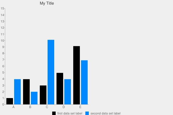
One thing to note is that whenever you have multiple values for a single hash key, you need to wrap them in an array, otherwise the code won’t properly execute.
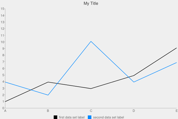
This is the same data, except applied to a line chart (I just replaced :type => ‘bar’ with :type => ‘line’):
And here it is again, except with just the first data set and applied to a pie chart:
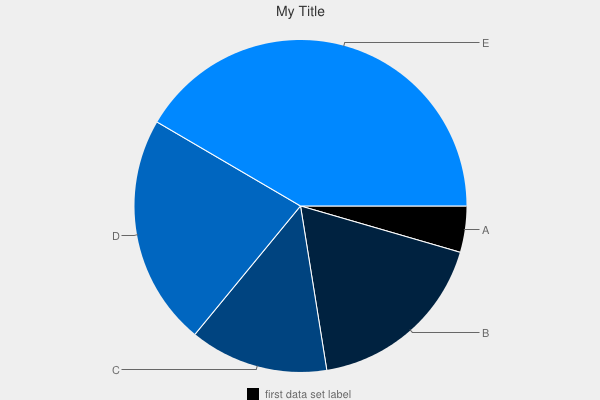
As you can see, its pretty easy to switch between graph/chart types. What’s more important is to think through the purpose of the graphic and choose the appropriate type. For example, if the data you are presenting is along a continuum (e.g., stock prices, demographic distributions, etc.), line graphs may make the most sense. But if you’re showing discrete datasets, you may want to use a bar chart.
3) Applying Object Orientation
Playing around with Googlecharts was fun, but ultimately, I wanted to use the gem in the context of a broader application. A typical use case may be wanting to display dynamic content that a user can request and format. I figured that this would be a good chance to extend a scraper for StubHub that I’ve been building on the side. Basically, this scraper goes through StubHub’s NBA ticket listings and saves the information about each event (home/away team, date of game, venue, minimum price and number of tickets available, etc.) into a SQLite3 database. I wrote the scraper to be object-oriented, so I thought it would make sense to build in the functionality to auto-generate bar charts using Googlecharts.
For the sake of brevity, I won’t post all of the code for the scraper and classes here, but you can find the repository on my GitHub page. The code below spells out the Team class, which houses the functionality to call a “search_team” class method and pass it a team name. This method will then create a bar chart dynamically using attributes of the team name that the user specifies. The method calls instance methods that perform actions like querying the database for price (“price for sql”), ticket (“tix_for_sql”), opposing team (“away_teams_for_sql”) and event date (“date_for_sql”) data. Additionally, I added in the ability for the class to search a hash of team colors to match the requested team against its primary and secondary team colors to format the chart dynamically. The underlying data map for team colors is housed as a constant in the “Baller” module, which is not reflected below. I scaled the y-axis based on the highest price in the price data array for the remaining home games. This way, I could make sure that I wouldn’t get data that fell outside of my chart’s range. Unfortunately, I wasn’t able to disconnect the scale of the primary y-axis (left side) from the secondary y-axis (right side), so the “Number of Tickets” bars look a little squished.
1 2 3 4 5 6 7 8 9 10 11 12 13 14 15 16 17 18 19 20 21 22 23 24 25 26 27 28 29 30 31 32 33 34 35 36 37 38 39 40 41 42 43 44 45 46 47 48 49 50 51 52 53 54 55 56 57 58 59 60 61 62 63 64 65 66 67 68 69 70 71 72 73 74 75 76 77 78 79 80 81 82 83 84 85 86 87 88 89 90 91 92 93 94 95 96 97 98 99 100 101 102 103 104 105 106 107 108 109 110 111 112 113 114 115 116 117 118 119 | |
When I call “Team.search_team(<”input team name”>)”, the program creates a file labeled with the appropriate team name in a sub-directory called “nba_charts”. As you can see, Googlecharts can be used to create charts dynamically based on variable user input.
4) Adding User Interaction
In order to create charts quickly, I added a command line interface for the program. This code allows users to specify which team they want to see ticket data for and it will create bar charts using the gchart gem and save them to the local filesystem. I went ahead and created four bar charts for the Knicks, Lakers, Thunder and Nuggets. I wanted to create a chart for my beloved Chicago Bulls as well, but the red-and-white combination didn’t show up very well on an off-white background, so I kept that chart out of this example.
1 2 3 4 5 6 7 8 9 10 | |
Here is the code when execute it in the terminal:
1 2 3 4 5 6 7 8 9 10 11 12 13 14 15 16 | |
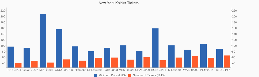
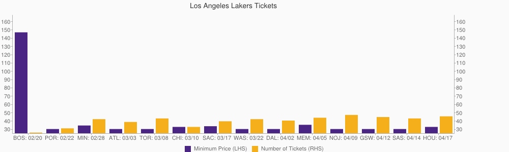
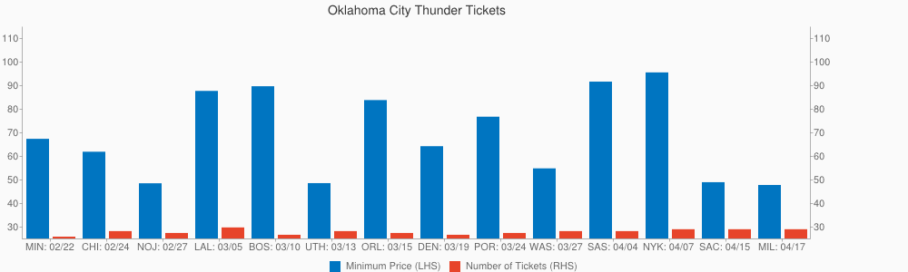
And here are the bar charts that are created by the program:
New York Knicks Tickets - Remaining Home Games
Los Angeles Lakers Tickets - Remaining Home Games
Oklahoma City Thunder Tickets - Remaining Home Games
Denver Nuggets - Remaining Home Games
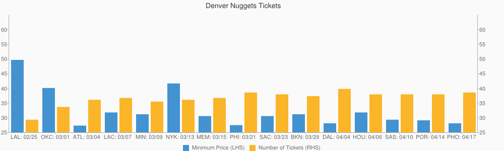
The left-hand y-axis refers to the price in dollars of the cheapest ticket, since StubHub’s primary event page indicates where ticket prices start from (i.e., the lowest price), and the right-hand y-axis refers to the number of tickets remaining in hundreds. I was having difficulty disconnecting the primary and secondary y-axes from each other, so the scale for the remaining tickets is not ideal (the primary y-axis determined the scale).
5) Final Thoughts
As you can see, the Googlecharts gem can be useful for quickly linking up a program with a data visualization tool. While it doesn’t appear to be the most powerful or most intuitive data graphing tool, its easy to install and the documentation is fairly straightforward, at least for basic functionality. I found it helpful to go through the code base for the Gchart class and try and follow the logic of each method whenever I got stuck. I found it to be a transparent gem in terms of figuring out what was going on “under the hood”.
That said, I found the syntax to be finicky, unnecessarily so, in my opinion. Also, it seemed like some of the more advanced functionality that I was looking for, that I was used to from using Excel many times, wasn’t readily available. Next on my list of graphing tools to try out is High Charts, a Javascript tool for interactive data graphics that also has an accompanying Ruby gem, Lazy High Charts. Then, I can learn how to create awesome stuff like this.